When I saw WWDC this year and that WatchOS9 would include advanced running metrics, I was stoked and immediately inspired to create an iOS app to visualize them.
I created Deets.Run with a number of objectives in mind:
-
Summary of all the new metrics in a compact convenient way per run, but also that allows for drilling down into each run and visualizing each of the new metrics.
-
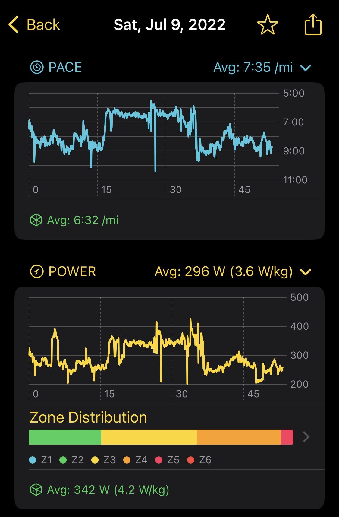
pace, power, heart rate, cadence, ground contact time, stride length, vertical oscillation
-
-
A way to view distance per week and to easily compare to prior week’s distances
-
Specifically, I wanted to be able to scroll back to the beginning of the year and see how my weekly mileage has progressed, and I wanted to know what the percent change was, week to week.
-
-
Home Screen widgets that displays that run summary and weekly distance
-
Deeper analysis with running power than what you would get out off the box with Apple’s Fitness app
-
I added power zones (based on a running functional threshold power value that you input), time in power zones, and power to weight ratio (which uses your weight in Apple Health at the time of the run to compare against your power for that run — a potentially more objective way of utilizing power.)
-
-
Heart rate zones
-
Categorize Runs, that way one could compare these new running metrics to other runs in the same category
-
In other words compare hard runs to other hard runs, easy to easy, races to races etc
-
IMO, this is a weak spot in Apple’s fitness app — all of the runs are just spat out in a giant table sorted by date, but there’s no further way to classify these runs for future inspection.
-
-
-
Trends by category — once runs are categorized, provide aggregated summary data, charts and trends for the category.
-
This was a key goal for the project — being able to take all of my harder threshold runs, for example, and then be able to analyze the advanced running metrics specifically for those runs (e.g. being able to compare stride length, power etc for just threshold runs)
-
-
Quality Intervals — A quality interval during a workout is the “work” period of the run (as opposed to when you’re warming up, recovering, or cooling down). I wanted to be able to compare the metrics specifically for the quality portions of my structured running workouts. The ultimate goal being that I wanted to be able to see the trends in my metrics over time, but specifically within the quality portions of my runs (don’t care about my metrics during my recovery or warm up, for example)
On a technical level, doing this project was a ton of fun. Under the hood it uses:
-
SwiftUI
-
Apple’s HealthKit API to access the running metrics
-
SwiftCharts – a brand new chart framework that was just announced this year at WWDC
-
Home widgets
All of which were new technologies to me and super fun to work with.
Please note that these new Apple Watch running metrics are only available on the Apple Watch SE and newer (series 6 or newer)